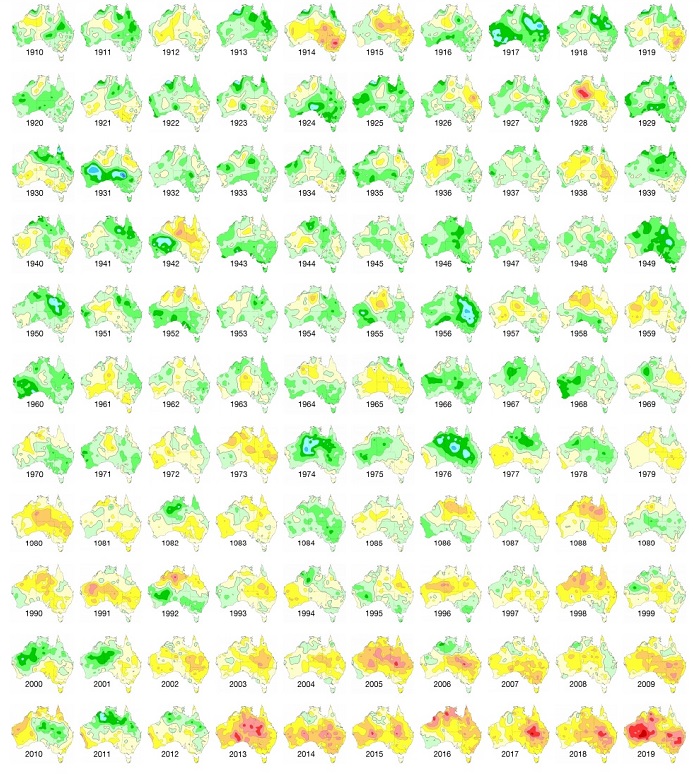
Bureau of Meteorology chart shows how temperatures have soared in Australia over the past century
|
Key points:
A chart produced by the bureau and updated with 2019 figures (shown above) displays a stark transformation over the past century. It shows the anomaly of mean temperature for each calendar year from 1910 to 2019, compared to the average over the standard reference period of 1961–1990. The colours range from dark blue (more than 3 degrees Celsius below average), through blues and greens (below average), yellow and orange (above average), and then brown (more than 3C above average). “Australia’s climate has warmed by more than a degree since 1910, which means very warm years like 2019 are now more likely to occur,” said Karl Braganza, the bureau’s head of climate monitoring.
Dr Braganza said alongside warmer temperatures, we were also seeing a trend in recent decades towards drier winter and spring seasons in some parts of the country. Andrew Watkins, manager of long-range forecasting at the bureau, said the hot 2019 — which had an average mean temperature 1.52C above average — was front of mind for many. “It was the talking point of all last year,” he said. “All the states and territories were in the top handfuls of temperature. Hot everywhere, pretty much. “Almost by definition if they’re records they are unusual.” The bureau has also produced another chart showing rainfall in each year since 1900. [on original]…..https://mobile.abc.net.au/news/2020-01-14/bureau-of-meteorology-chart-shows-how-temperatures-soared/11857404
|
|
No comments yet.
1 This month.
Australians deserve the truth
about
AUKUS – https://aukuspublicinquiry.com/

30 July – WEBINAR (Free) – Is Nuclear Power the Solution to Climate Change? https://my.acaw.org.au/event/acaw-is-nuclear-power-the-solution-to-climate-change
18:30 – 19:45 ACST
19:00 – 20:15 AEST


PETITION – To: Prime Minister Anthony Albanese and the Australian Labor Government

of the week – Australians for War Powers Reform (AWPR)
To see nuclear-related stories in greater depth and intensity

Leave a comment